Wikipedia gets a visual makeover after 10 years, here’s what is changing
Instead of scrolling and skipping through sections, you can now access ‘Table of contents’ from the top corner and directly click on any section without putting an extra effort to scroll.
_1600925482551_1600925492949.png)
_1600925482551_1600925492949.png)
Guess what, Wikipedia, the website that most of us have been visiting to get more information on any topic, is finally getting a new look after a decade. Being the most common go-to- website for millions, Wikipedia's desktop version is now becoming more user friendly and will span across two years.
“We think it's time to take some of these ideas and bring them to the default experience of all users, on all wikis, in an organized, consistent way. Over the next couple of years, the readers web team will be researching and building out improvements to the desktop experience based on research and existing tools,” said the mediawiki post.
Also read: Google reveals what Indians searched for the most in August
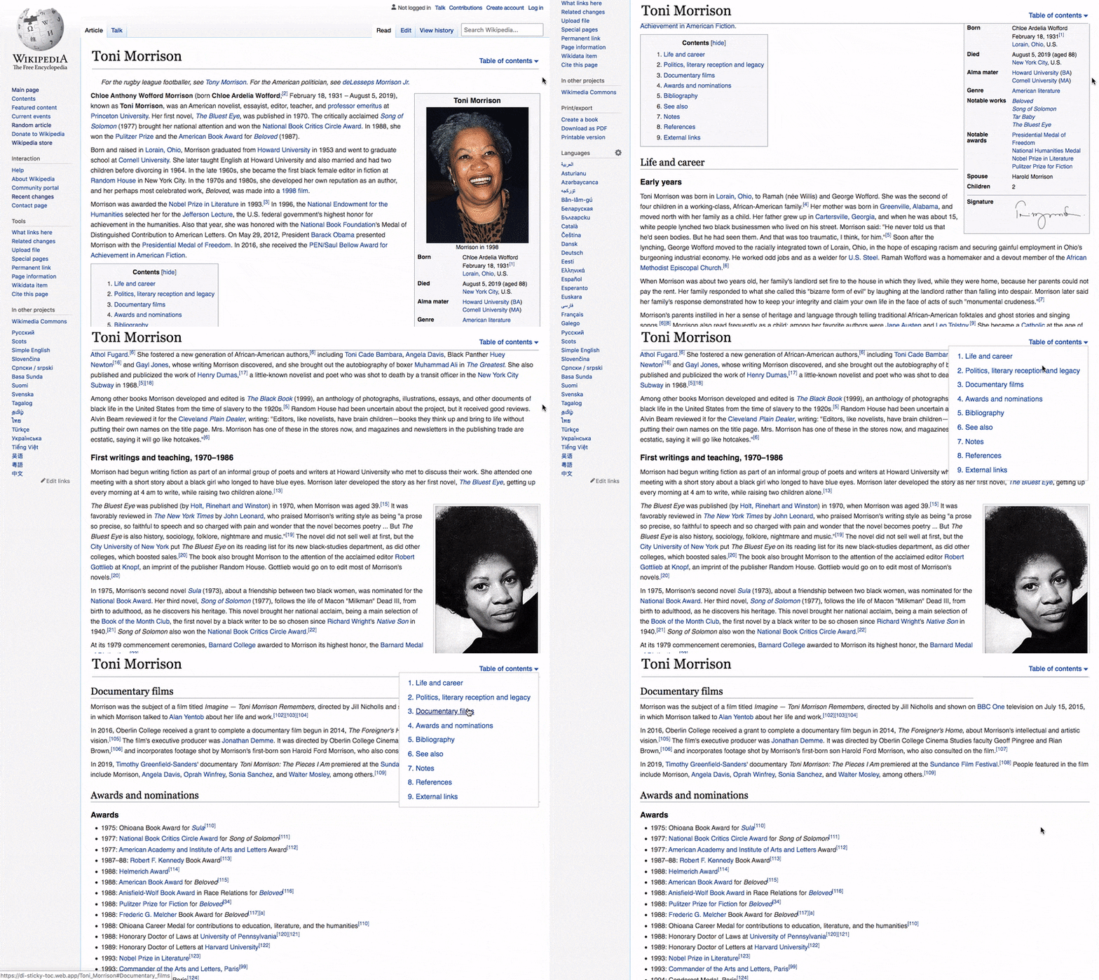

It is possible to see some of the changes that are about to take place as Gif. One of the major changes will be coming to how you access ‘Table of contents'. Instead of scrolling and skipping through sections, you can now access ‘Table of contents' from the top corner and directly click on any section without putting an extra effort to scroll.
There will also be a collapsible sidebar that will come as a part of the roll out. The purpose of this is to let readers view the content with more focus, pushing out extra text out of the screen. Also, there could be an easy one-click button to change the language of the page.
And lastly, the update is also said to add improvements to the in-site search tool so users find it easier to search pages. This may come besides a reconfigured logo that's a bit more colourful.
Catch all the Latest Tech News, Mobile News, Laptop News, Gaming news, Wearables News , How To News, also keep up with us on Whatsapp channel,Twitter, Facebook, Google News, and Instagram. For our latest videos, subscribe to our YouTube channel.


