These are the alternates for Stadia logo that Google rejected
Renoux said that there is a 200-pages long document that introduces essential elements pertaining to Stadia, which help in identifying the system and explaining how to use them to build the brand and give a meaningful voice to Stadia.
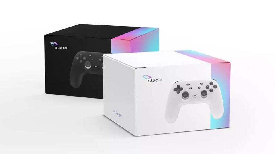
Google Stadia is one of the foremost gaming services in the world. Earlier this week, Google's game-streaming service turned one. Now, one of the Stadia's designers have shared the images of the rejected Stadia logo and merchandise giving us a glimpse of what the Stadia branding could have looked like.
IveGotHam and independent design director Jean-Lou Renoux have shared some creatives including images of Stadia logo, merchandise and advertisements on Stadia subreddit and his own website. These images give us insights into the alternates that Google was considering at the time of launching Stadia.
The Google Stadia logo, as we know it today, has a flowing ribbon-like design with Orange and Pink colour scheme. Renoux says that the Stadia colour scheme includes “vibrant oranges and a deep plum” that “evoke feelings of whimsy and thrill.” He says that these colours “create a bold gradient that helps to unify and entice gamers onto a new frontier.”

Renoux said that there is a 200-pages long document that introduces essential elements pertaining to Stadia, which help in identifying the system and explaining how to use them to build the brand and give a meaningful voice to Stadia.
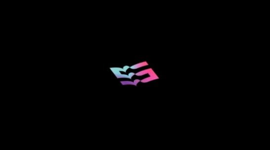
As far as design alternatives are concerned, Renoux shared an image with a snake-like design having Blue, Pink and Purple in the colour scheme. The Reddit user, on the other hand, shared how Stadia merchandise would have looked-like with this logo.
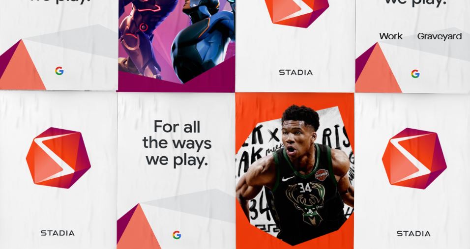

Another Stadia logo that was being considered used the colour scheme that is being used today but with a different shape. It had a diamond-like design with an S on top in White.
Google, obviously, rejected all these designs and selected the free-flowing Stadia logo that we know it today.
Catch all the Latest Tech News, Mobile News, Laptop News, Gaming news, Wearables News , How To News, also keep up with us on Whatsapp channel,Twitter, Facebook, Google News, and Instagram. For our latest videos, subscribe to our YouTube channel.


