Microsoft redesigns icons for Windows 10 with more colourful ones
Microsoft is redesigning its Windows 10 icons after five years. The new icons look more colourful as opposed to the present ones.
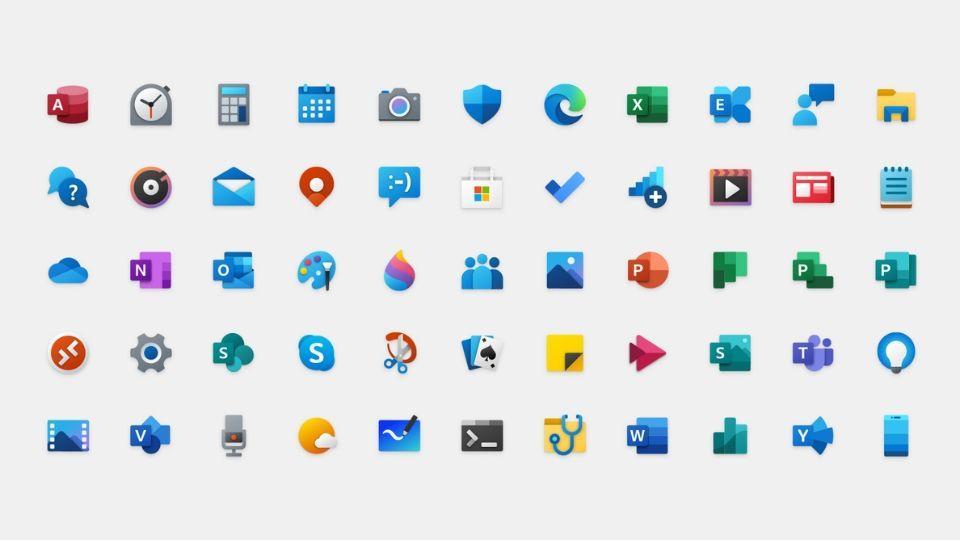
Microsoft has redesigned its entire set of system icons for Windows 10. The new redesigned Windows 10 icons feature a 'Fluent Design' and have more depth and colour to them. The new icons will be rolled out in a phased manner.
Microsoft has essentially replaced the monochromatic silhouettes of icons with more colourful ones. Microsoft in a blog post explains how the company worked on the icons using its "Fluent Design Language". The company also said the new icons show a more uniform look across multiple platforms like Android, iOS and Mac.
"Leveraging the Fluent Design System, we introduced depth and color to our iconography. These additional cues are subtle, but they make a world of difference when scanning an interface," Microsoft explains in its blog post.
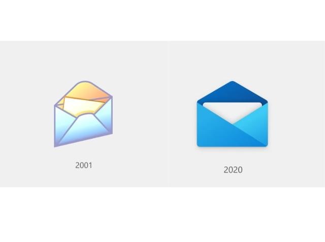
Microsoft has also shared how the icons have evolved over the years. For example the latest Mail icon looks like the first one introduced in 2001 but with a modern twist.

The new Windows 10 icons will be visible to users with app updates from the Microsoft Store. Microsoft has already rolled out the 'Mail' and 'Calendar' icons for users in the Release Preview ring for Windows Insiders. As for Windows Insiders who are in the 'Fast' ring will get to see the new Windows 10 icons from today. Microsoft will release more redesigned icons in the coming months.
Microsoft has started updating the system app icons for Windows Insiders. The new ones don't use your system accent color, and look pretty out of place in the current start menu. Perhaps the 10X start menu could make its way over to desktop sooner rather than later. pic.twitter.com/bsJnXu6sC6
— Cody Carson (@hologei) February 20, 2020
According to one Windows Insider who has received the new icons, the colour scheme doesn't support the system accent colour. The start menu on Windows 10 is using the default blue colour as the background colour instead of the system accent one.
Catch all the Latest Tech News, Mobile News, Laptop News, Gaming news, Wearables News , How To News, also keep up with us on Whatsapp channel,Twitter, Facebook, Google News, and Instagram. For our latest videos, subscribe to our YouTube channel.


