Instagram’s got a gaudy new logo but elegant redesign inside
The new Instagram logo isn’t very enticing because of the bright colours and glossy look that just makes me want to call 2016 the year of lame logos
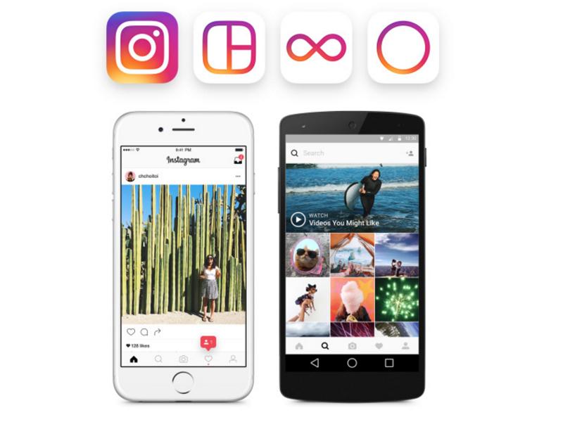
Instagram has a new logo and as usual, not a soul I've talked to seems to like it over the old one, but on opening up the app, things start to make sense.
"The simpler design puts more focus on your photos and videos without changing how you navigate the app," Instagram said in a blog post. "Our updated look reflects how vibrant and diverse your storytelling has become.
The new logo seems like the company just dumped all the leftover colours into the mix while redesigning, because inside the app, there are none.
The app, now lets pictures shine with the buttons, comments, sections and everything else being black or white. For a photography driven app, this decision to make everything other than photographs makes complete sense. Besides making the UI clean, it lets you observe the photographs and videos better.
The icon however, isn't very enticing because of the bright colours and glossy look that just makes me want to call 2016 the year of lame logos. First Uber got a new logo that made no sense, Google's Play apps got a weird Play Button around them and now Instagram has gone more colourful than anyone needs to.
So, if the icon wan't hidden in a folder already, it might just be time to put it there. Or just pass on a few app updates, hoping that they'll rectify it soon.
Catch all the Latest Tech News, Mobile News, Laptop News, Gaming news, Wearables News , How To News, also keep up with us on Whatsapp channel,Twitter, Facebook, Google News, and Instagram. For our latest videos, subscribe to our YouTube channel.


