Microsoft to replace Calibri as the default Office font
Calibri had become the default font for Office suite in 2007.
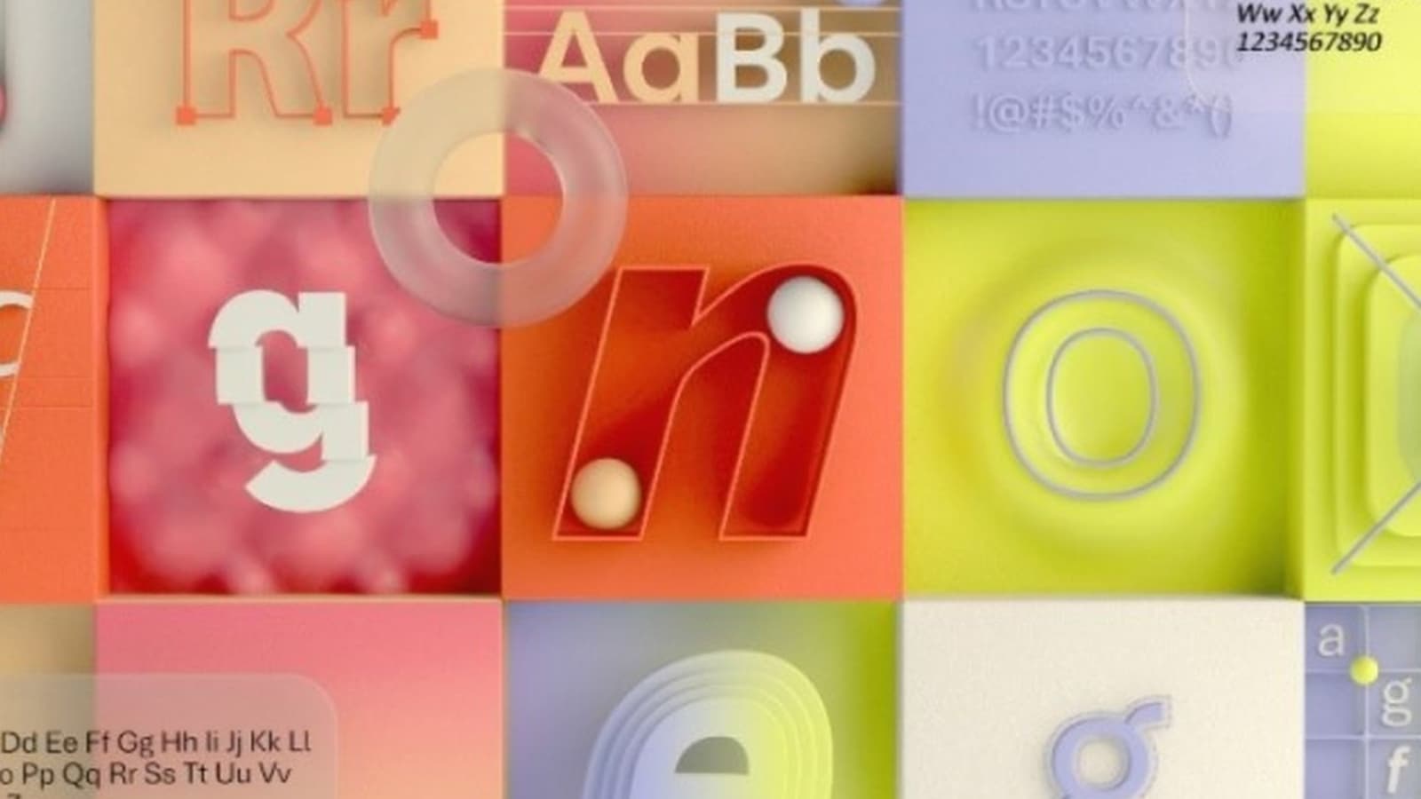
Microsoft is looking for a replacement for Calibri, which has remained the default font for the Office suite since 2007. The company has identified five potential replacements as well. Calibri, however, will continue to exist as one of the fonts.
“Dear Calibri, we've loved our time together, but we've outgrown this relationship,” said Microsoft in a tweet on Thursday. The company is also asking users to tell which is their favourite.
We need to talk. What should our next default font be? pic.twitter.com/fV9thfdAr4
— Microsoft (@Microsoft) April 28, 2021
Five potential replacements for Calibri are Tenorite, Bierstadt, Skeena, Seaford, and Grandview.
Tenorite has been designed by Erin McLaughlin and Wei Huang. According to Microsoft, Tenorite has an overall look of a sans serif but with a warmer and more friendly style. The company says elements such as accents, punctuations, and large dots make the font comfortable to read.
Bierstadt, designed by Steve Matteson, offers contemporary sans serif typeface inspired by mid-20th-century Swiss typography. Microsoft points out that the font offers high readability as well as clear-cut stroke endings.


Skeena, designed by John Hudson and Paul Hanslow, offers modulated strokes and noticeable contrast between thick and thin. According to Microsoft, Skeena is ideal for long documents and shorter passages.
Tobias Frere-Jones, Nina Stössinger, and Fred Shallcrass, who designed, Seaford, explain: “We didn't want to be too literal about these references, but many of their themes loosely guided our work, such as a preference for differentiation of shapes over repetition and symmetry. And since most of the running text is set in lowercase, the earliest drafts focused on the lowercase branches, bowls, and terminals, tracking how those elements would relate across the various styles.”
You can learn more about these fonts here.
Trivia: Calibri had replaced Times New Roman as the default typeface in Office 2007 and replaced Arial as the default in PowerPoint, Excel, Outlook, and WordPad.
Catch all the Latest Tech News, Mobile News, Laptop News, Gaming news, Wearables News , How To News, also keep up with us on Whatsapp channel,Twitter, Facebook, Google News, and Instagram. For our latest videos, subscribe to our YouTube channel.

